Questus.com
UX, Art Direction, Design
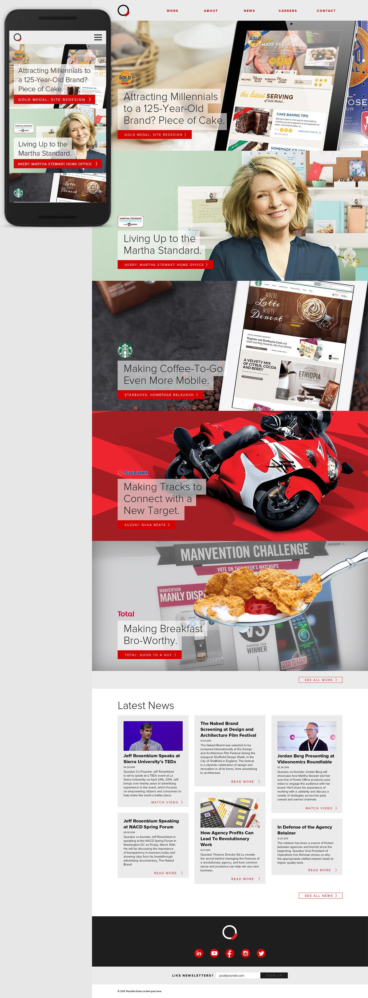
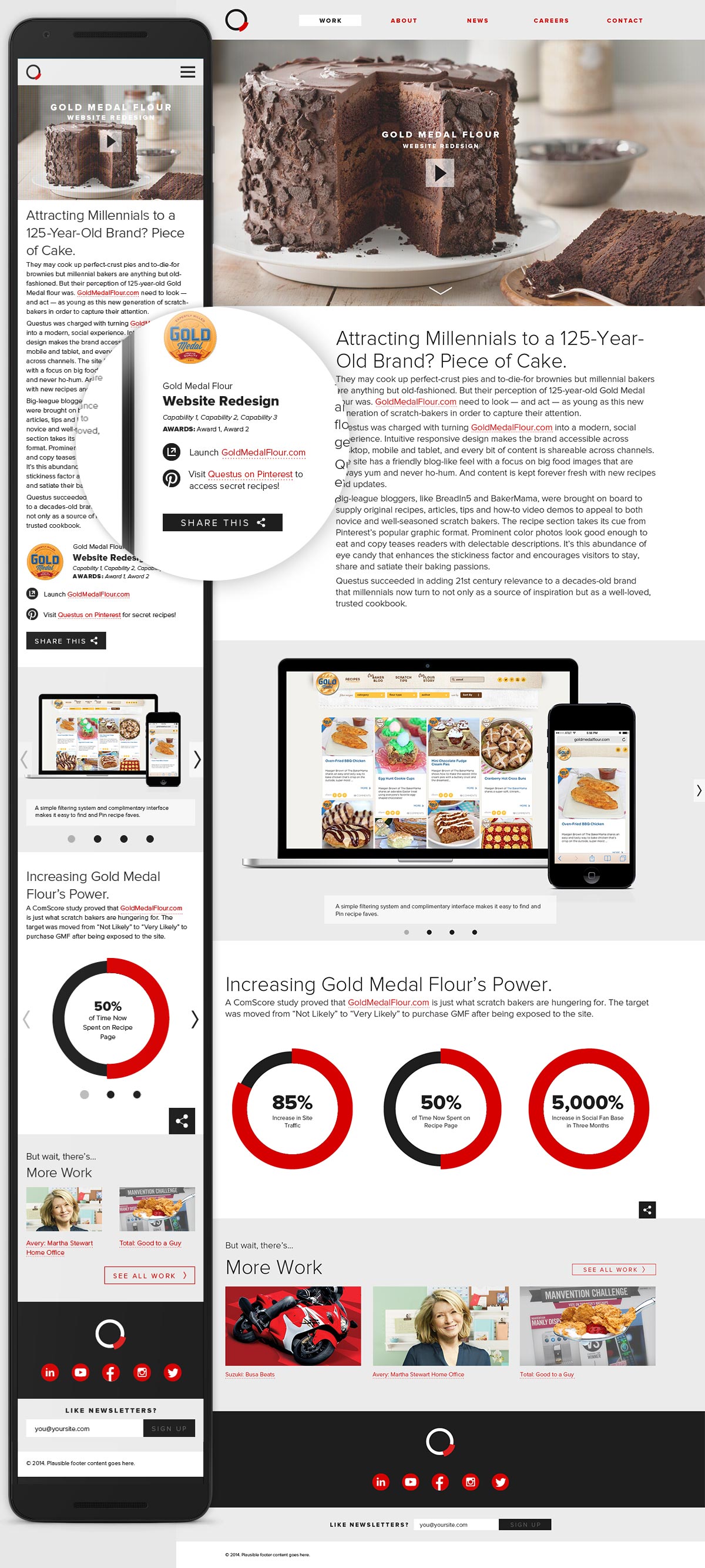
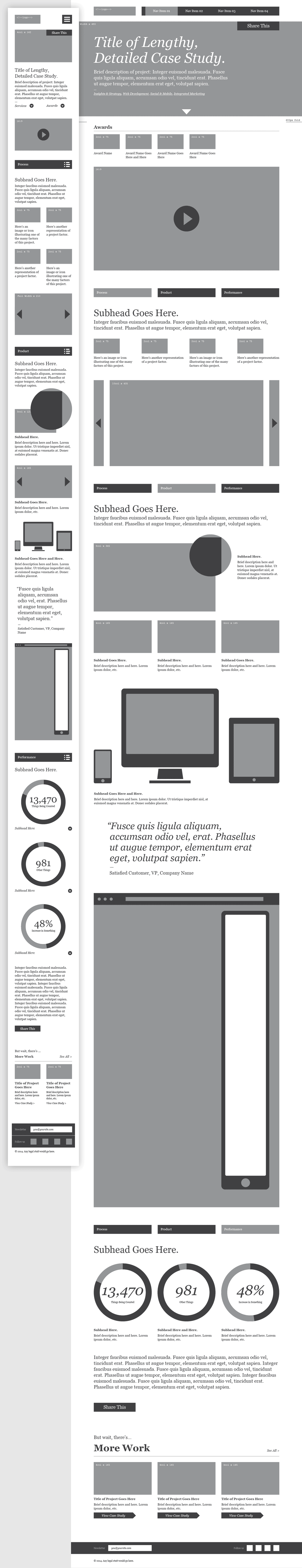
The agency's website had fallen behind the times: it needed a grid and it needed media queries, stat. I was tasked with redesigning the site to showcase large, edge-to-edge visuals while being mindful of the speed and functionality required of a responsive build.
I began by auditing the site content and building a new sitemap, identifying key page templates, and defining the basic UI requirements. From there I designed a set of hi-fidelity wireframes at multiple breakpoints. When it was time to transition into visual design I focused on defining the design system — the rules governing the typography, interface elements, and content layout across devices — and then applied it to a number of key pages before handing the project off to its dedicated team.
Agency: Questus \ ECD: Jeff Wagener \ CD: Brian Hull \ Copywriter: Carolyn Goldhush
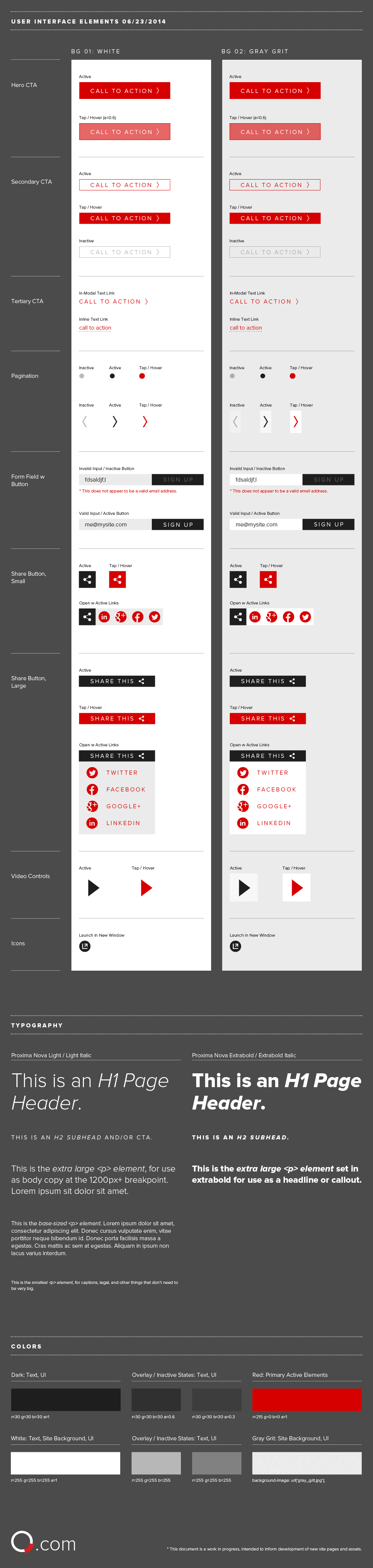
As the page designs were being developed, I began collecting the UI elements in a separate document. This helped us to track the overall system and informed the development of new elements.
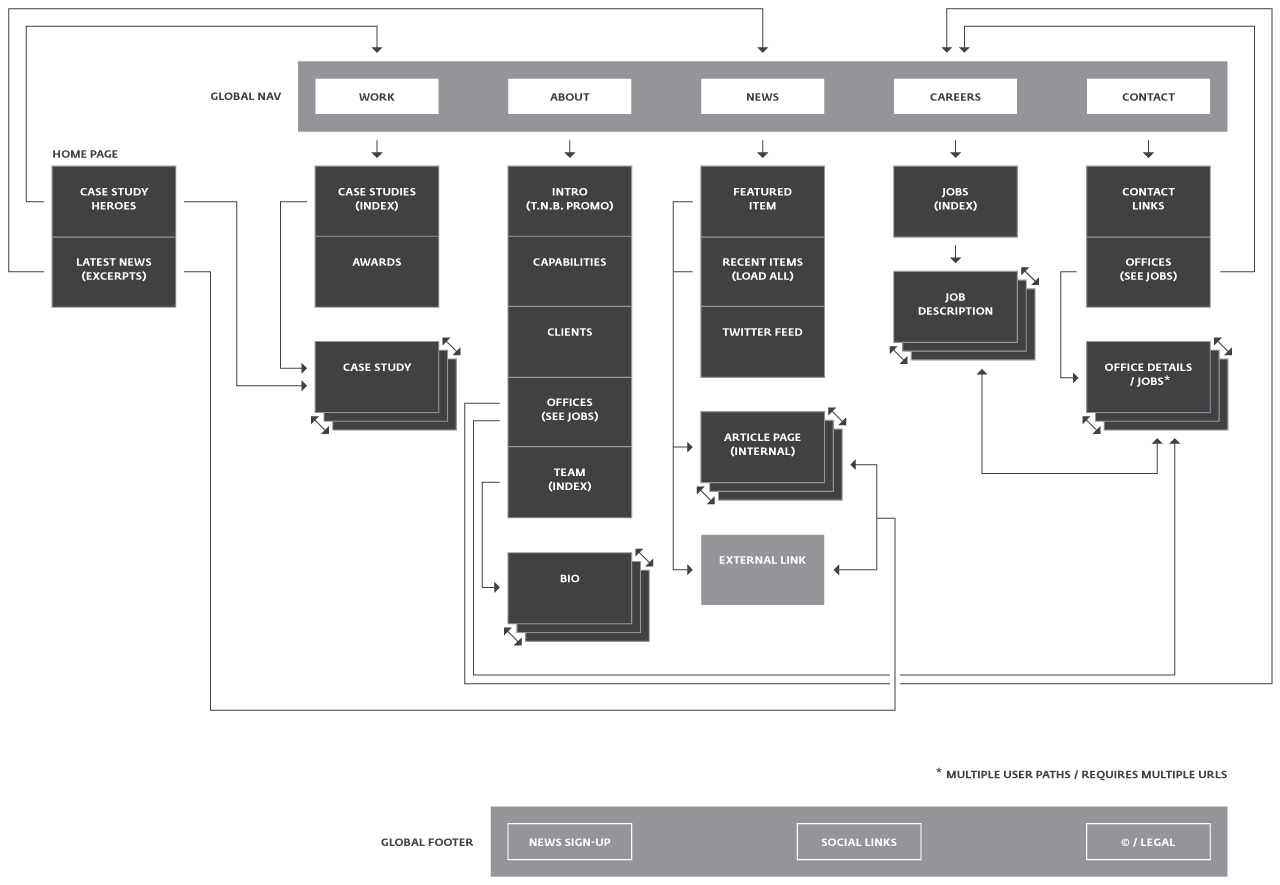
The beginning: the sitemap / IA sketch.

Max-and-min-width layouts for the home page and case study template. Both are designed to be modular — layout elements can be mixed and matched depending on assets available.
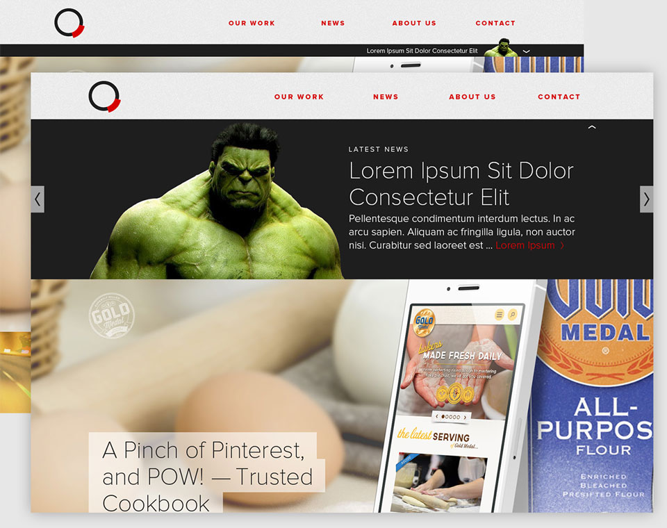
Browser sketch of the home page panels. We wanted a transition method that felt fancy but wouldn't bog down performance.
Concept mock for an expandable home page promotion area, where breaking news and quick-hit projects that don't have a full-blown case study put together could live.
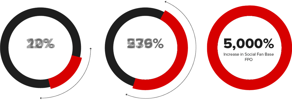
Leveraging the agency logo as a data visualization element.